The Punjabi Dictionary app was created 9 years ago and was the first of its kind for iOS. It features over 40,000 words and phrases with transliteration in English, Gurmukhi, and Shahmukhi (Urdu). Since the app’s last update in 2017, iOS has seen a lot of changes both in appearance and features—from the increase in screen size to the addition of widgets and prioritization of accessibility. The current state of this app is in need of a redesign.
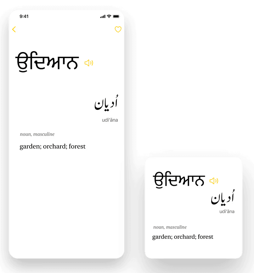
I designed a “word of the day” widget that modernizes the original app interface to fit with the current iOS 15 paradigm and creates a more accessible and aesthetic learning experience.
Role
UX/UI Design
Team
Engineering Team
Year
2021
previous user interface
Initially, my focus was solely on creating a widget that captured the essence of the app. After thinking about the contents of the widget and how users would interact with it, I realized that I had to start the design process at the very beginning-redesigning the dictionary entry page.
pain points
Screen size
empty space as a result of shorter screen size
Dull interface
lack of visuals creates a boring experience
Bad "speak" discoverability
would have to long press to find speak feature
no dynamic type
not compatible with vision accesibility settings
display appearance
not compatible with dark mode display settings
Defining the pain points in the app’s main word entry page helped me visualize what a modernized, more accessible version of the app and widget could look like. The issue with the screen size and dull interface were more or less easy fixes; however, trying to find solutions to the other pain points would require brainstorming and a good understanding of Apple’s Human Interface Guidelines.
Dynamic Type
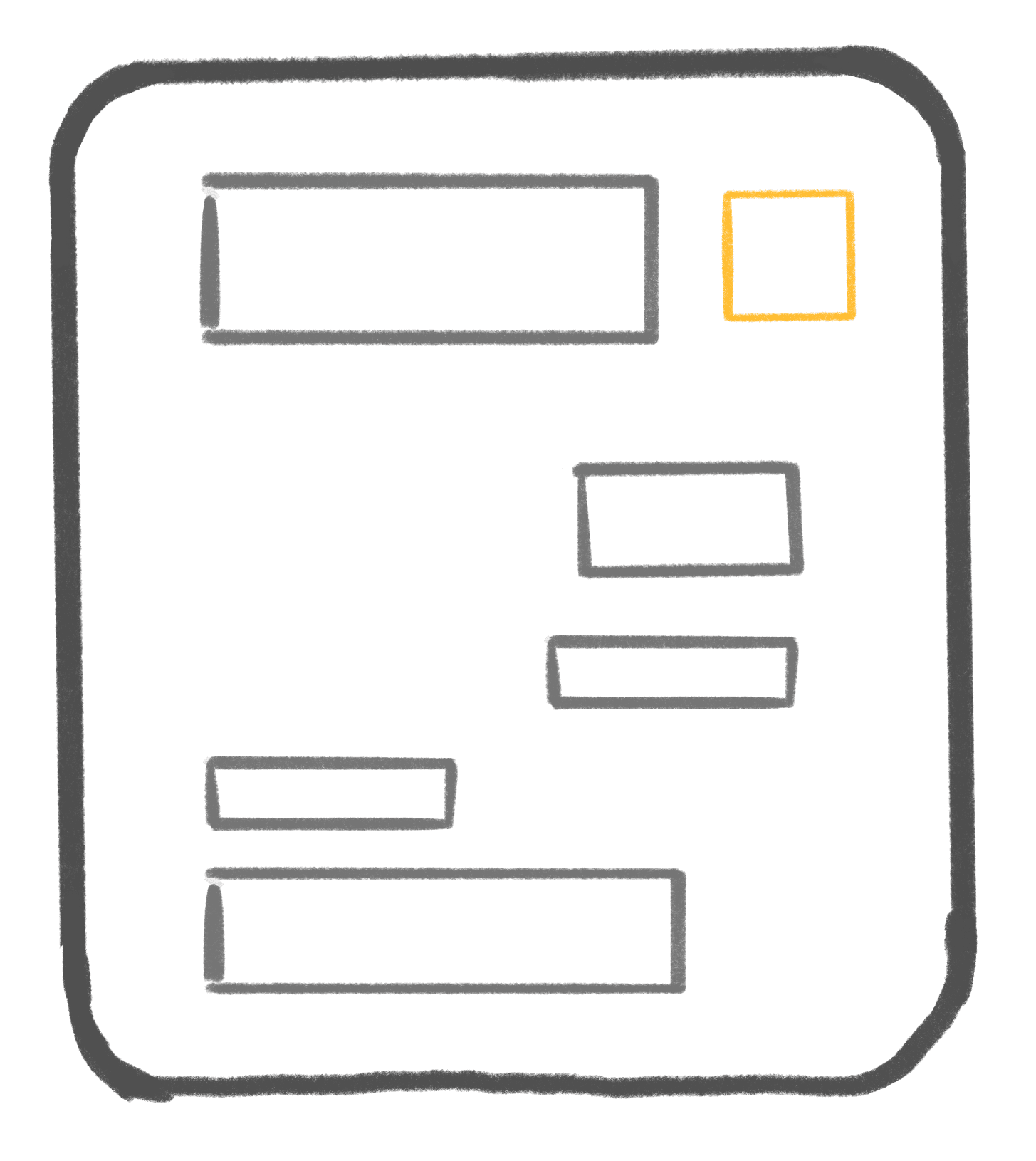
To design with dynamic type, I needed to consider the motion of text on the screen as its size increased in relation to other text
How can the type provide a comfortable motion for the eyes to move while reading and preserve information hierarchy?
Reading Style
If each piece of information was on its own baseline, it could scale properly and maintain readability.
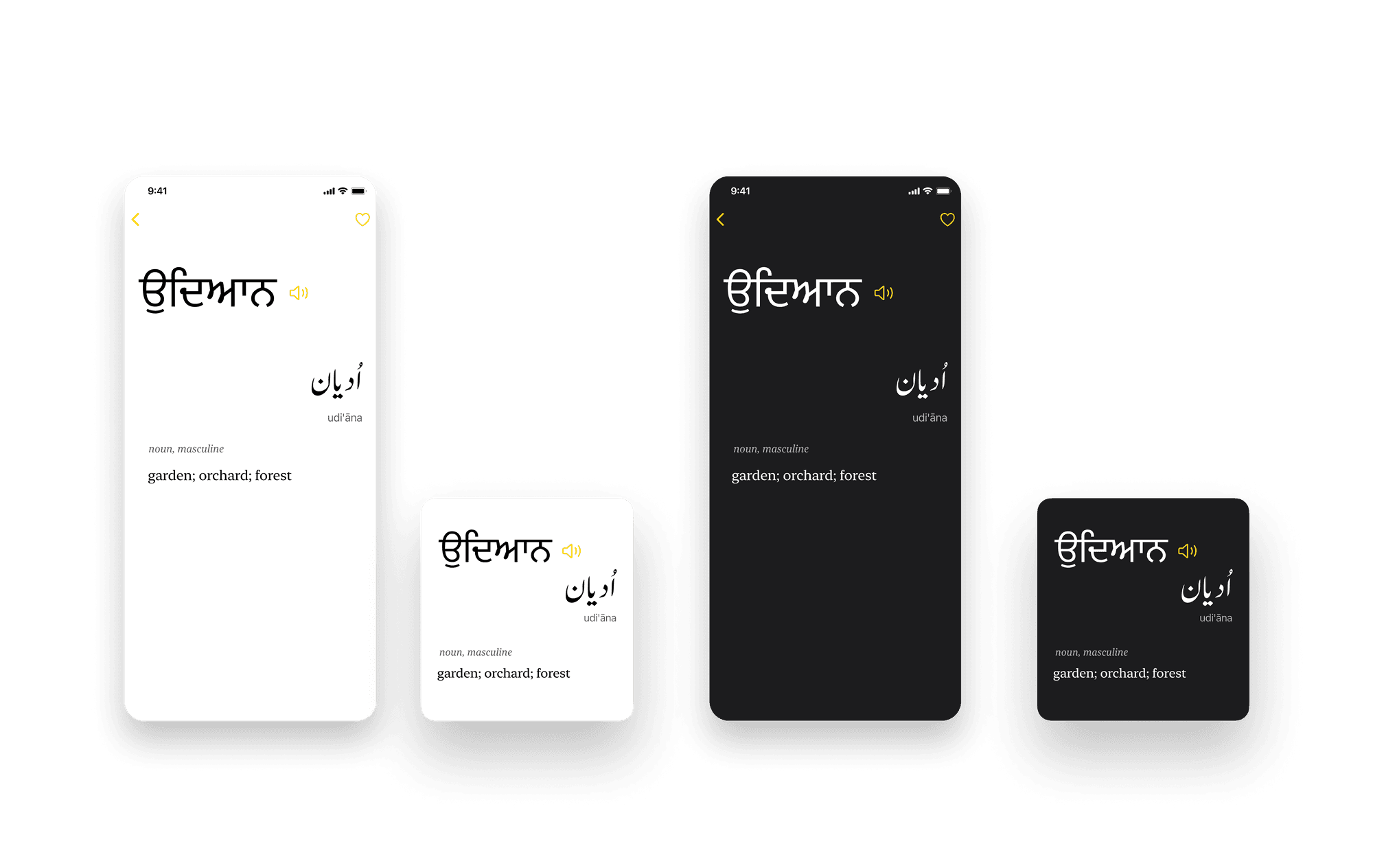
Display Appearance (dark/light mode)
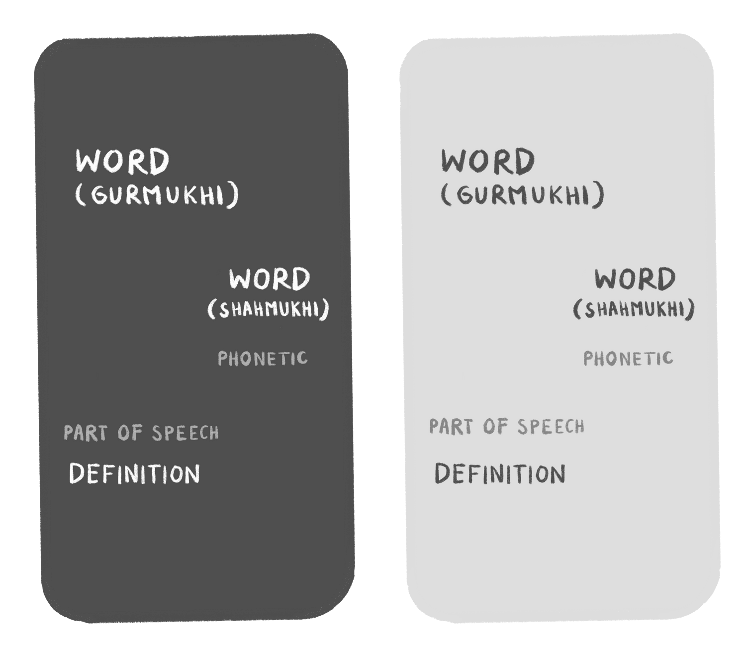
Contrast in colors plays a huge role in toggling between different display settings. I explored having simpler colors.
Speak discoverability
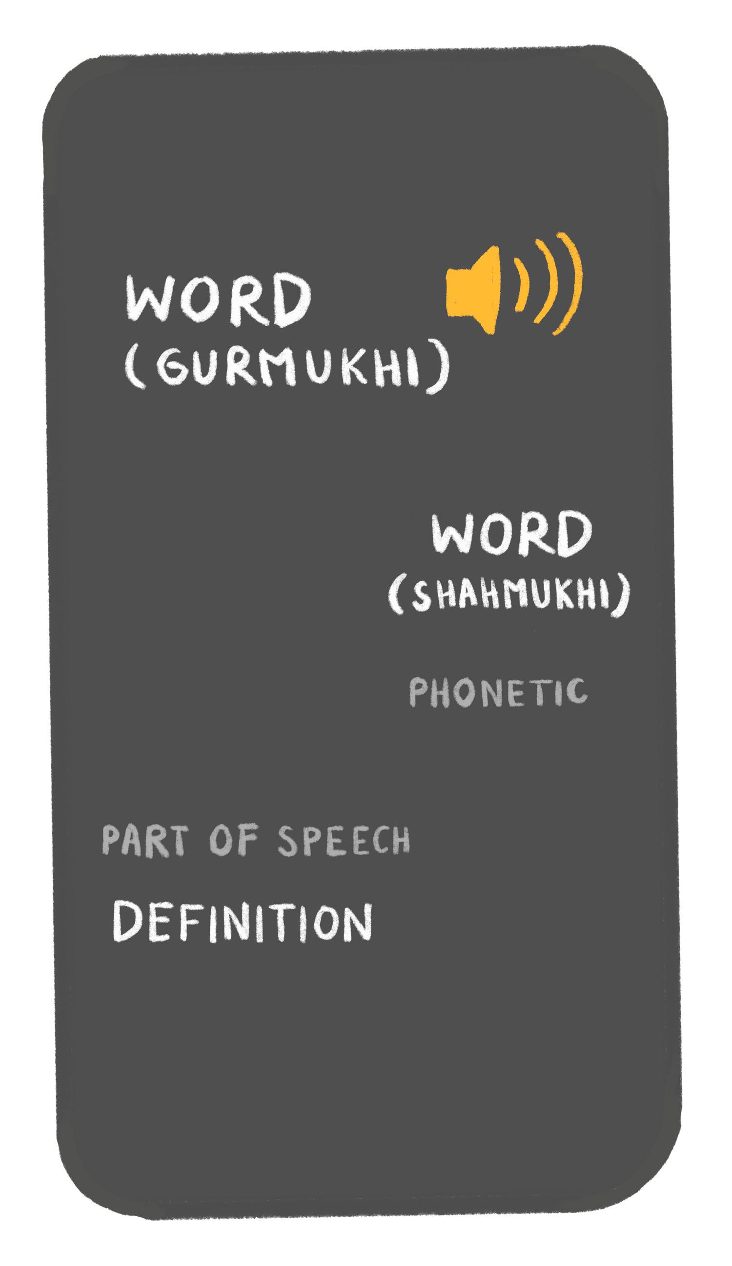
The speak feature needs to be easily discoverable for the user to hear the correact pronounciation of the word. Long pressing to play the sound felt insufficient and was not clear enough of a visual cue to indicate that the action was available and had been completed. I considered adding a speaker icon since it is an intuitive element that is seen across other online dictionaries and text translators
the design
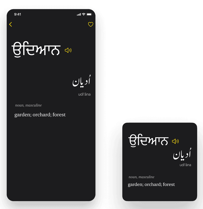
My final designs fit the iOS 15 design paradigm better than the original app design and prioritized accessibility.
Final page and widget designs
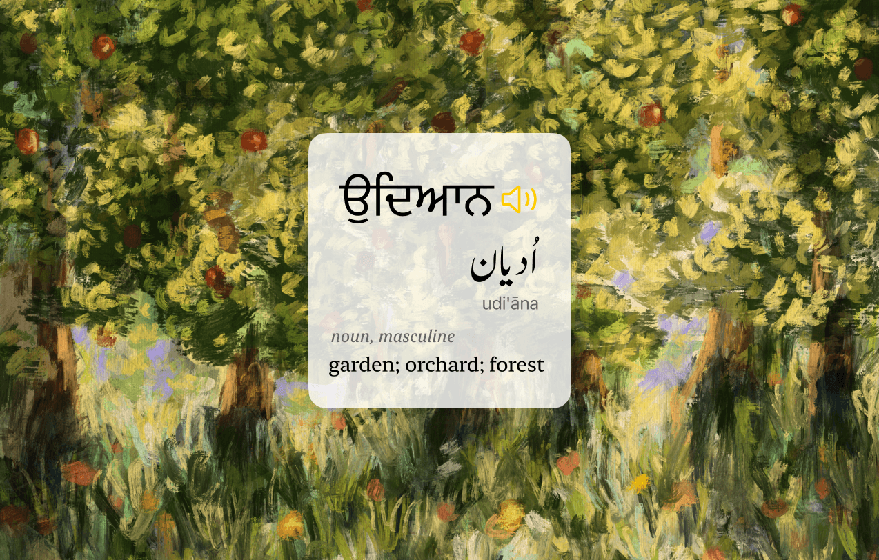
For visual learners, an illustration could add even more depth to the word entry as well as the aesthetics of the widget. As an example, I inserted my painting of a garden to depict the definition of the word ਉਦਿਆਨ.
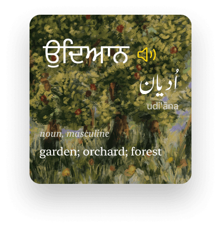
widget with illustration
An Apple design guidelines virgin
Since this was my first time designing with Apple's Human Interface Guidelines, I was able to get a good grasp on the UI components that make their products visually accessible.
Step back and look at everything, before making a change
When designing even one feature of an app, I found that you have to make sure that it serves a purpose in the app’s overall functionality.
Humbled by my typography skills
Designing with dynamic text is crucial for any app that is word heavy. I had to refresh and refine my typography skills for this project.
Easter Egg
With over 40,000 words in the app, it would be an arduous task to illustrate every dictionary entry. Some words and phrases are more abstract and cannot be illustrated. It would be a fun “easter egg” for the users to search for around 200 words that have been illustrated. These illustrations could also provide a good opportunity to feature the work of a variety of Punjabi artists.
I am currently working with the engineering team to redesign the app in its entirety with the same principles that i explored here for the app's next update.


