Recora is a health-tech startup that delivers virtual cardiac rehabilitation to elderly patients.
As the sole product designer, I led the user experience/ visual design of Recora's tablet, mobile, and web applications. Many patients were interacting with a smart device for the very first time which made it crucial to prioritize accessibility. I gained invaluable insights on the unique needs of elderly users and how they interact with technology.
My largest initiative at Recora was to redesign the home screen experience of the app to be more engaging, intuitive, and personalized.
Role
UX/UI Design
Interaction Design
Animation
Team
Head of Product
Technical PM
Engineering Team
Year
2023
Recora's old home screen
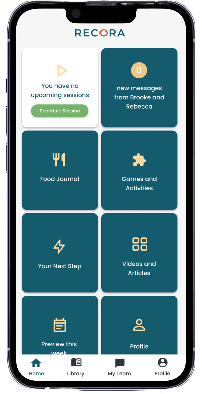
The original state of the Recora app home screen was a tile layout inspired by GrandPad (a tablet for seniors) and allowed patients to join their tele-health sessions, record their vitals, chat with their care team, and more.
When each new feature launched, it would get added as a tile to the grid and maintained in no particular order. Soon enough, the app homescreen became a stack of tile buttons with no context on the features offered.
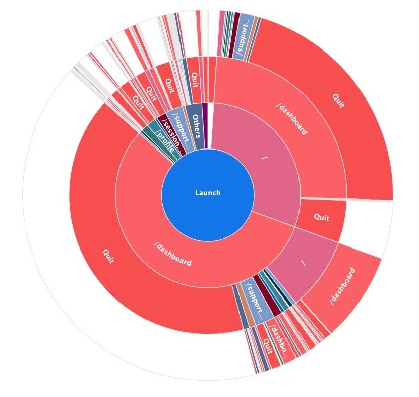
An analysis of overall time spent on app revealed that patients were not engaging outside of their zoom sessions.
A majority of patients would only interact with the app to join their session, then promptly exit the app until the next session.
Engagement = Better progress for the Patient
It is clinically proven that the more engaged a patient is in their rehab program, the more success they see in their progress. Engaging with clinically-relevant tools on the app also enables the care team to deliver tailored care and empowers patients to track progress.
Engagement = Better insights for the Business
The company starts to accumulate tech debt as we continue to launch features that are rarely interacted with and at times not even seen by patients. As the business scales, it becomes crucial to get accurate insights on these new features.
Orientation / Journey Mapping
Feature Consolidation
Self-Guided / Personalized
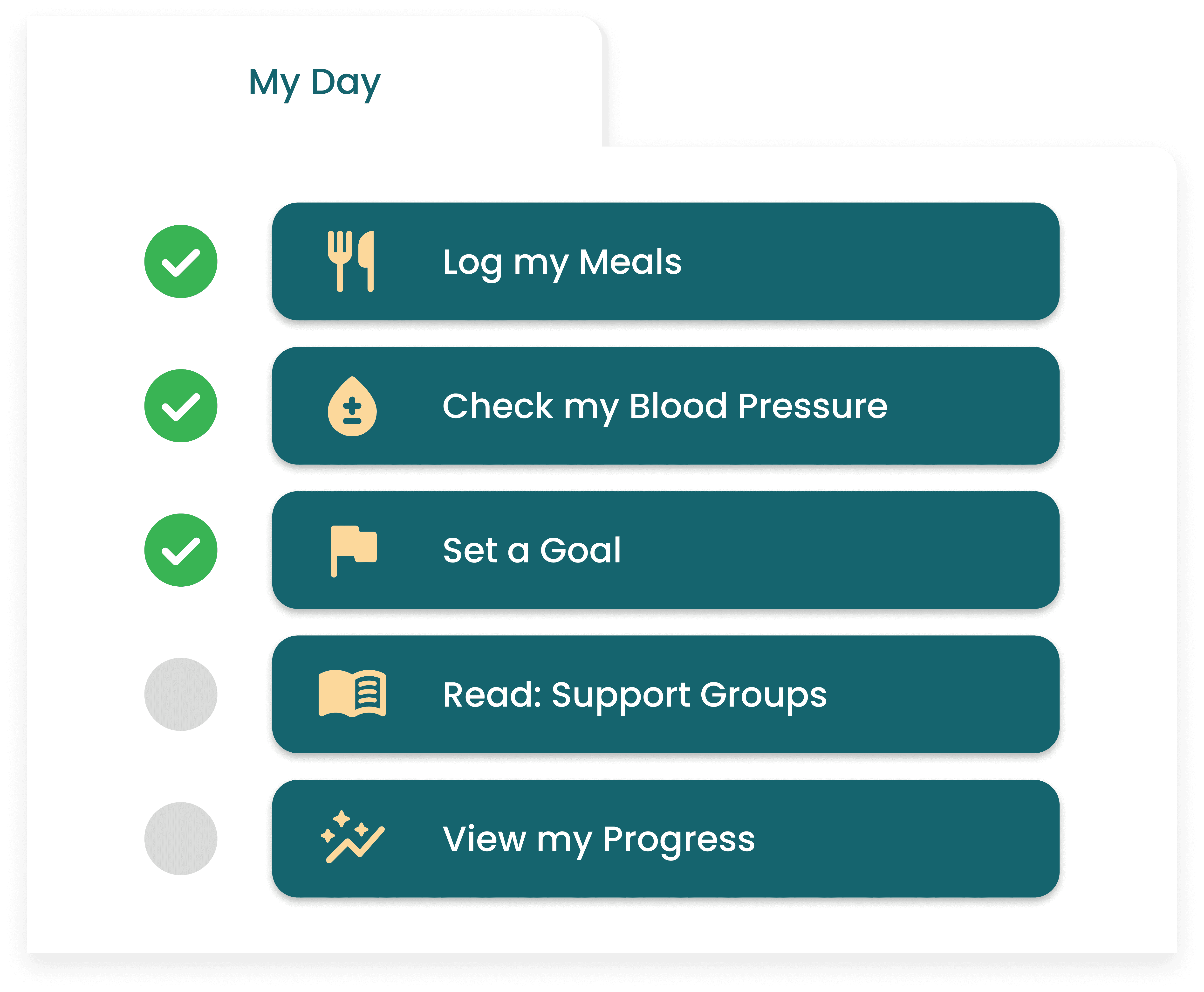
A Daily Task List
I highlighted next steps for patients by creating a daily task list, curated by the clinical operations team and updated according to the patient's rehab progress. Previously , these steps were scattered across many different tiles. I brought them forward as a main feature so patients would experience satisfaction checking off tasks, promoting more consistent in-app engagement between sessions.
Animations and Confetti Moments
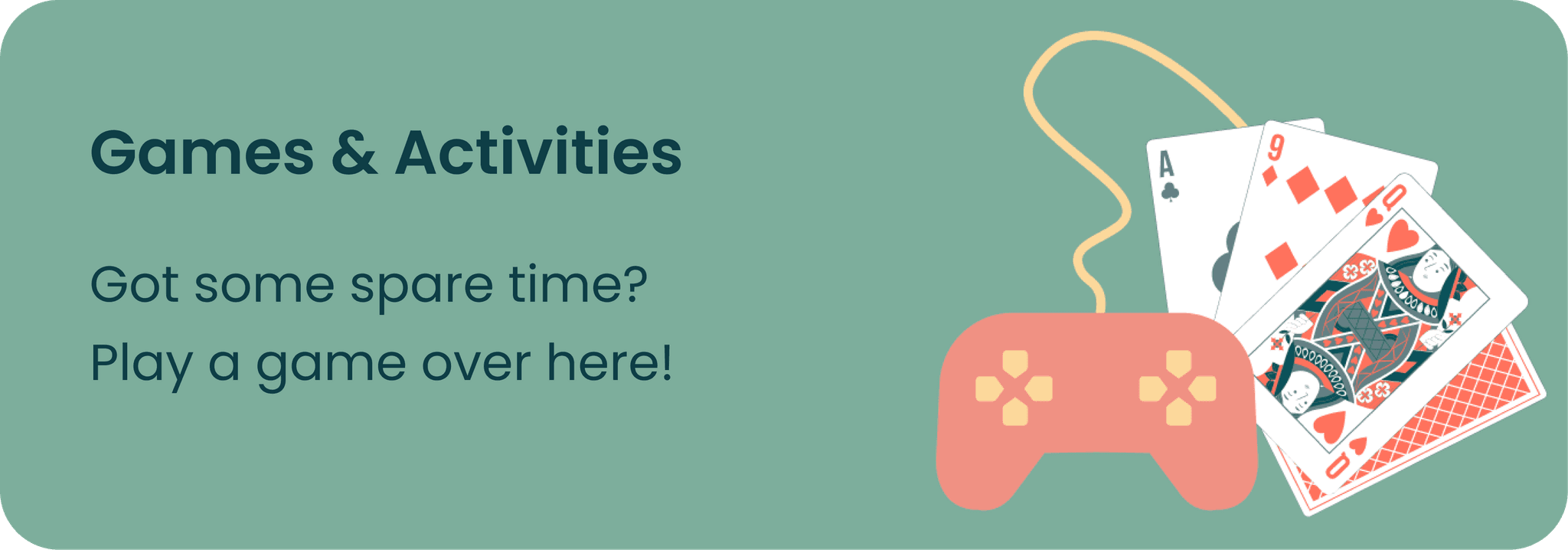
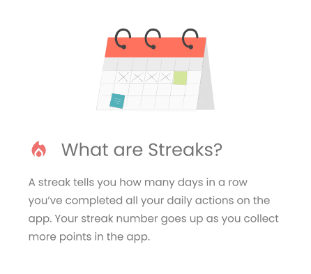
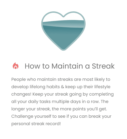
I needed to create a positive feedback loop for patients so they would continue to engage in the app. I wanted to expand on the sense of achievement patients could experience within the app by introducing earning streaks and points. I created animations that would trigger when completing individual tasks, all tasks for the day, and more. Visualizing their progress in this way would give more purpose to the patient.
Discover More Tab
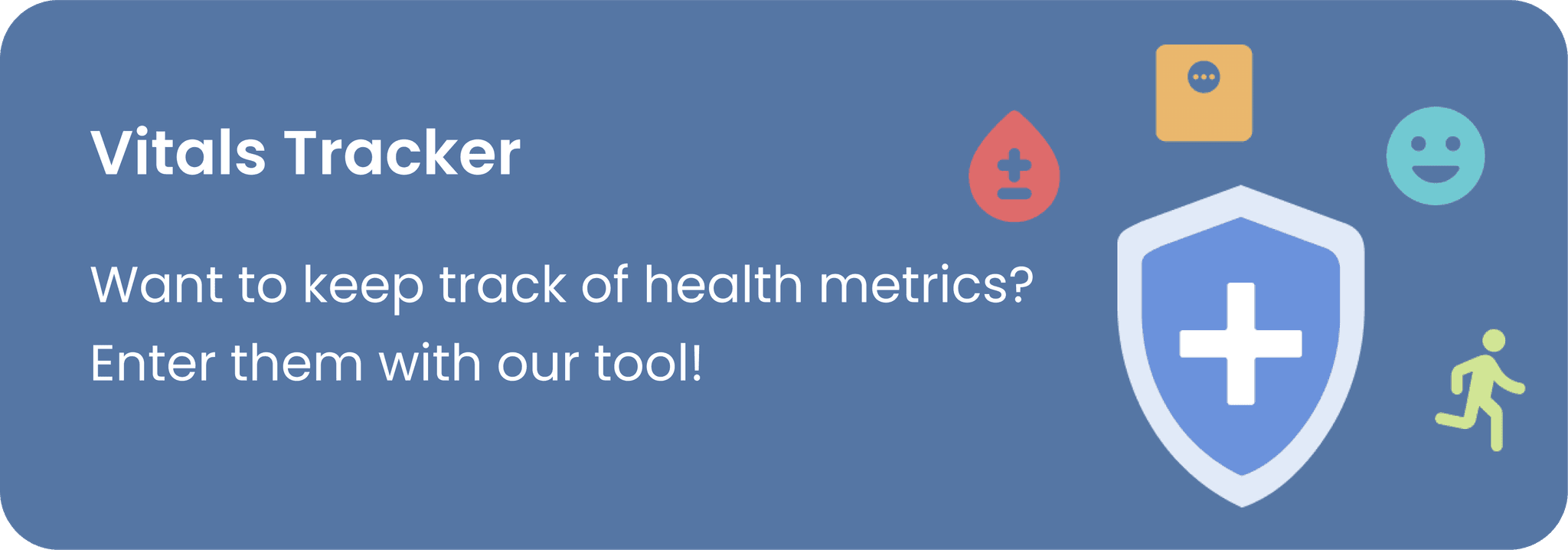
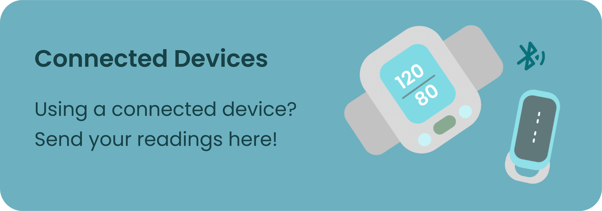
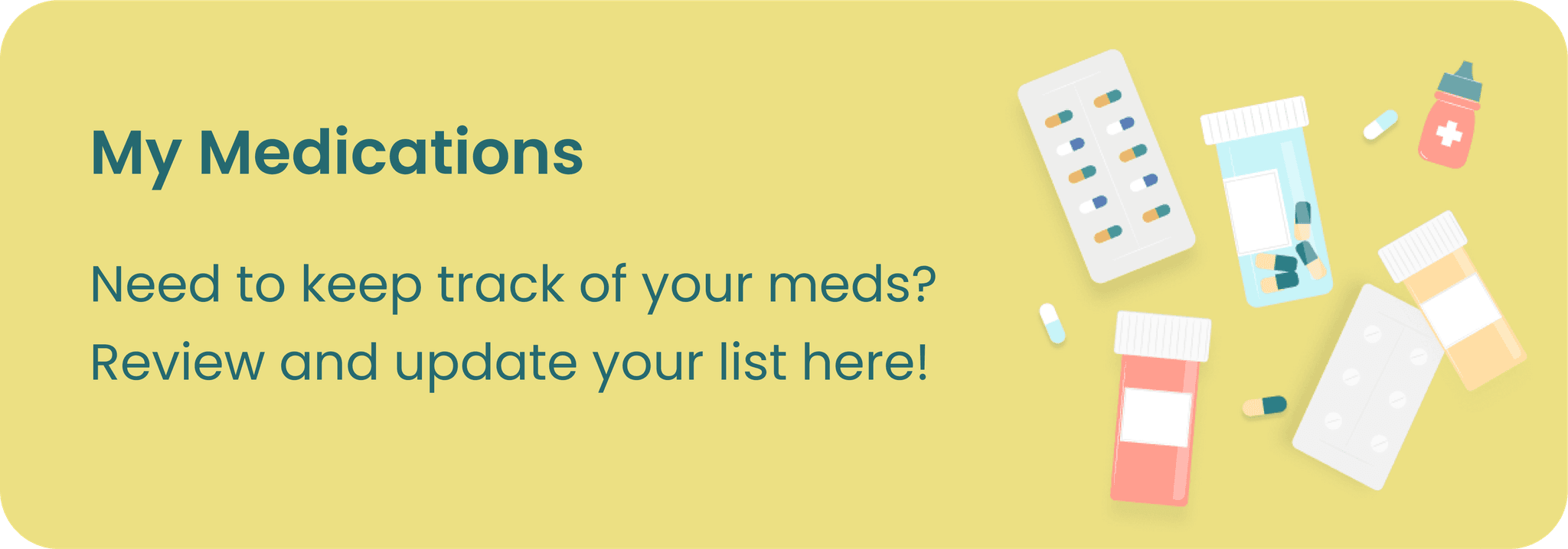
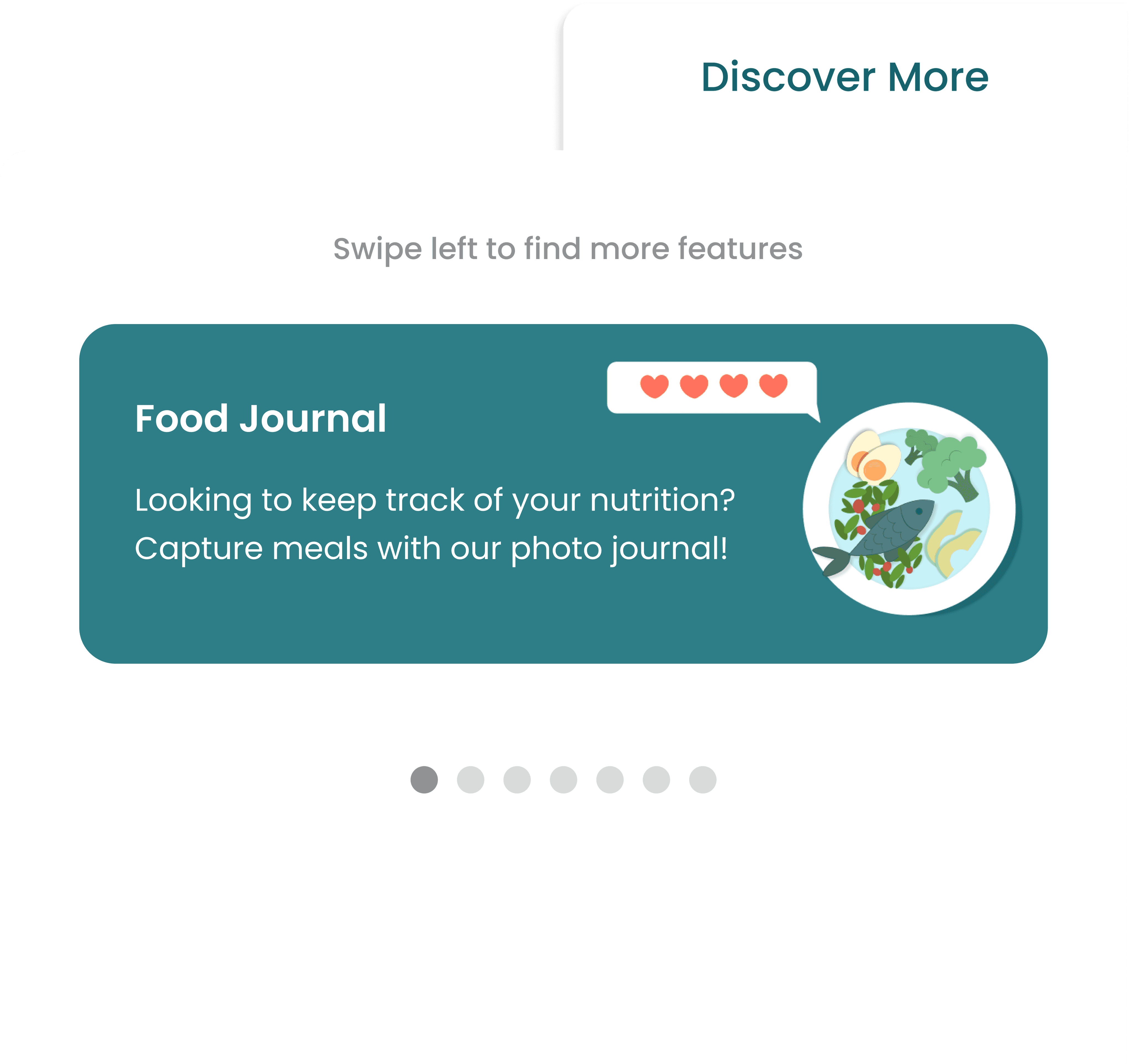
While the necessary interactions were all under the task list, we still wanted to house features that may be helpful for some patients under a "discover more" section in the home screen. This was also a unique opportunity for us to clean up and nest functionalities of features while providing more context on what features do.
Changing the Copy
An easy fix, but all the more powerful fix was to change the language on the app. Instead of saying "your" implying that someone else was in charge of their treatment we changed it to "my" to empower patients to take charge of their health journey. We added more personalized elements such as surfacing their most used feature first and a welcome greeting at the front.
If nothing else, patients should be able to join their sessions
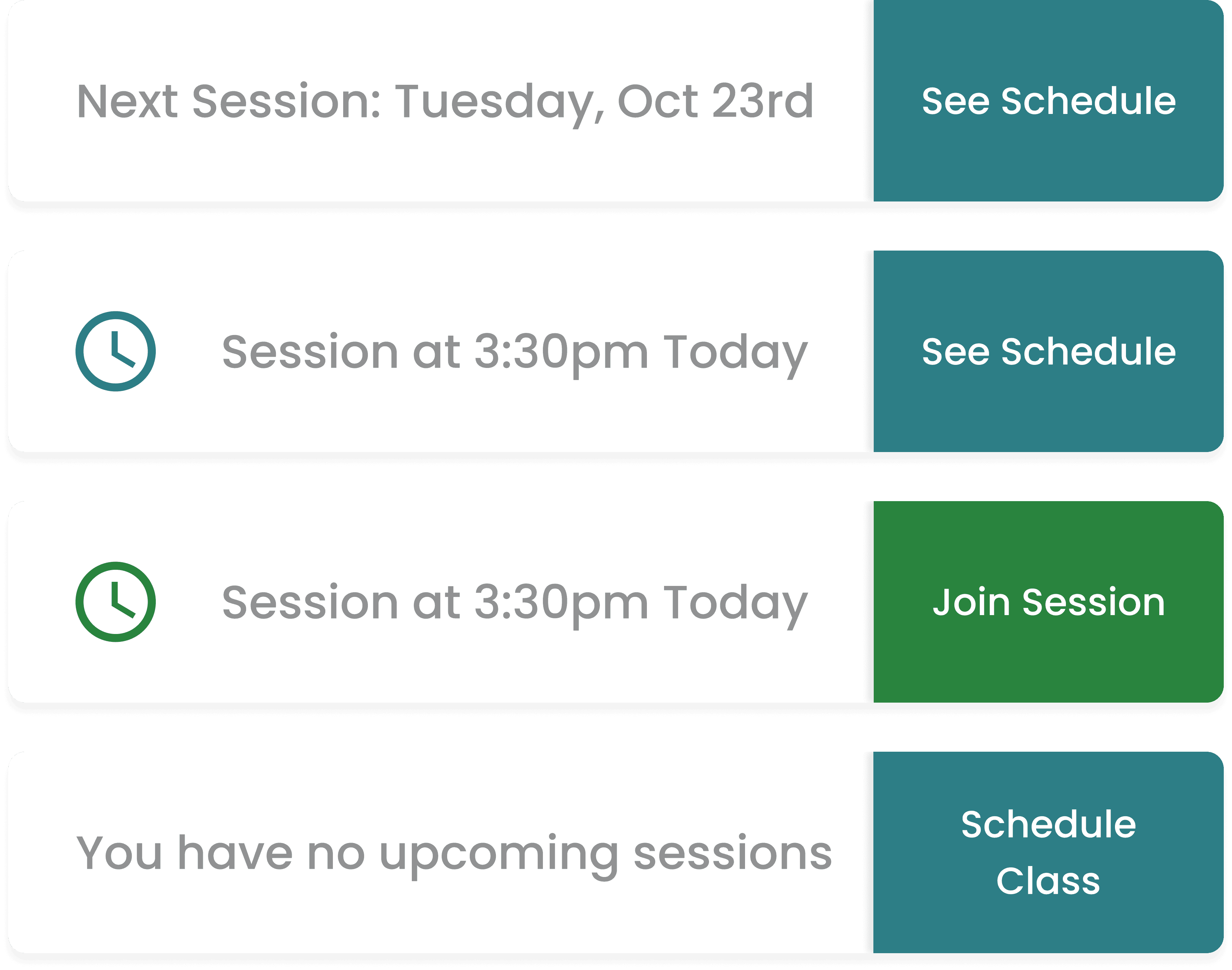
Joining sessions needed to be frictionless for patients. Previously, there was a tile that turned green when it was time for a session to be joined. I needed to come up with a new version of this feature that would fit with the other new features and also be as intuitive. The result was a join session tab with an adaptable button. This button indicated when a session was available to join and allowed for a quick preview of a patient's schedule
Would patients understand new navigational models and concepts?
Some new features that I had designed required scrolling, a behavior that was hard to explain to our patient demographic.
This is where copy became super important. I added affordability with some extra copy as tool tips . I also made sure that the UI remained minimal with nothing "below the fold". I also added some tool tips to explain how earning points and streaks worked.
Arranging features by Hierarchy
We arranged all the features in hierarchical order, prioritizing the "join session" tab near the to. The space between the session tab and task list could later by useful for message notifications and other CTAs.
New home screen design
Rewriting the existing app architecture
I worked with a technical project manager and the engineering team to hand-off complex user flows that required rearchitecting much of the app’s existing flows and creating new triggers for animations..
Arranged app flows in Figma for Engineering to reference
Getting buy-in, Training patient-facing staff, and Marketing
I compiled an animation of the proposed home screen redesign to present to the executive, partnerships, and clinical teams to get buy-in.
Change is difficult for patients in our demographic, so we slowly rolled out the changes by sending out email campaigns to patients orienting them to the new design. We used my animation of the new homescreen to train enrollment specialists and get them accustomed to talking to patients and hospital partners while also being able to troubleshoot when needed.
Final home screen animation
After rolling out the new homescreen we found that the new concepts were sticky and engaging!
Increase in Point Totals
Patients were starting to check off the tasks from their weekly task list and accumulating points for them which meant that engagement was increasing over time.
Diversified Interactions
Patients were spending time exploring the app clicking on features that they had never clicked on before. Usual user flows that we were seeing previously became more and more diversified.
Before Home-screen Launch :
"Quit" indicates leaving the app after session
After Home-screen Launch :
Diversified clicks, patients completing tasks
Solo designer on a Design-led project
It felt amazing to take the lead on this design and project delivery. It was rewarding to create a product start to finish and be able to support and communicate those designs in written specs and meetings with executives. I was fortunate to have a team that was rooting for me the entire time.
The elderly just want to feel empowered to learn new things
Might seem like a challenge to design an app compatible for a device that your patient-base has a hard time understanding, though I saw it as this unique opportunity to introduce different elements and navigational models that users could practice and feel empowered to use on other apps on their devices.
