In 2019, I started sharing my visual art on instagram and twitter to talk about self-care, create meaningful connections, and highlight my Punjabi heritage. I titled my page “Lalaaree” which is Punjabi for someone who brings color to things. After growing my following to over 1k in the span of a year, I was producing pieces that people wanted to purchase and I needed a platform to sell my products.
I designed an e-commerce website that represents the Lalaaree brand and allows me to sell my art around the world!
Role
Web Design
Brand Design
Marketing
Year
2021
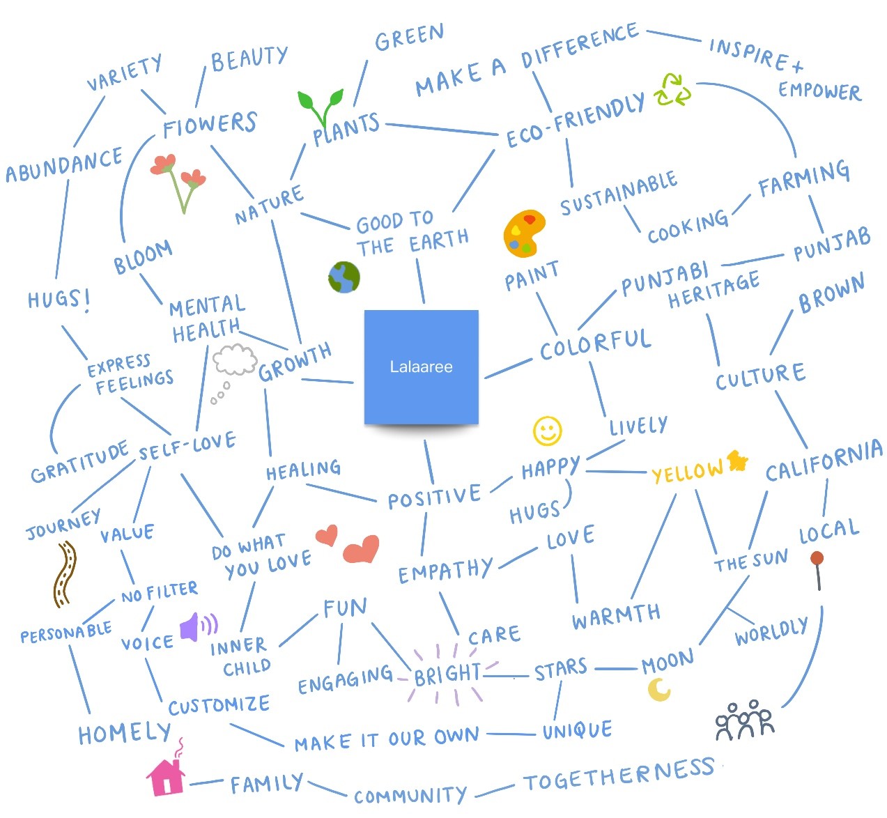
A mind map for the brand
Defining the Brand
Defining my personal brand was tough and it was easy to get lost in all of my thoughts. I documented my brainstorming session to give me a direction to take the website. I wrote down all the words that I associate with the Lalaaree brand.
Organized
customers can easily find what they're looking for
Personable
customers can know more about me and the message behind my art
Visually Pleasing
a work of art on its own
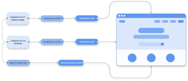
Journey Map
I laid out a customer journey map to define the ways my website could be approached. Since most of my art was advertised on social media, the website needed to be mobile-friendly. There was a unique opportunity for me to also focus on marketing and optimizing for search engines.
Wireframes
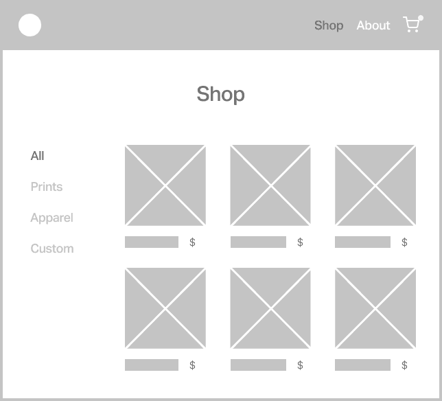
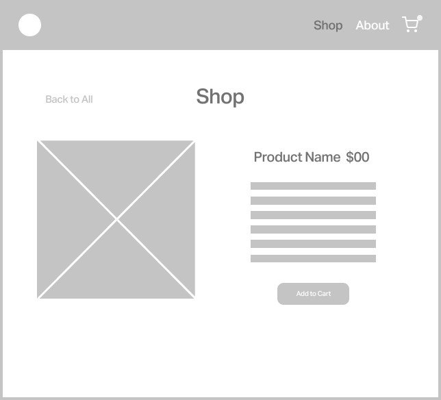
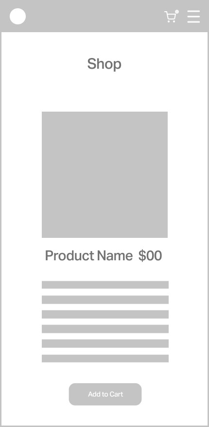
In making wireframes for the initial look of the site, I made sure to highlight “shop” as the main call to action. I found that organizing products by their type was more intuitive given the variety in my product listings. An “about” section would make the vibe more personable and help give a story to the artist behind the pieces.
Desktop Wireframes
Mobile Wireframes
Illustrations
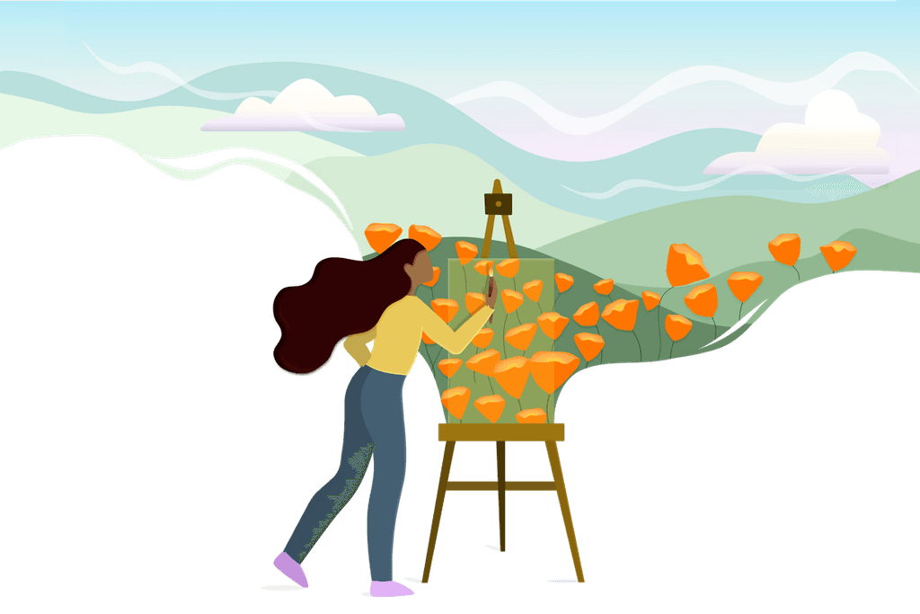
The splash page sets the tone for an entire website so in this case, it only felt fitting to make it colorful and inviting. I took the ideas from my mind map and sketched out illustrations for the header and navigation. My goal was to make these illustrations both dynamic and interactive.
The Splash Page
Drawing ideas from my brand brainstorming session, I roughly sketched out illustrations that represented some of the words on my map. I wanted my splash page to set the tone for the entire website - tell the brand's story and invite the customer to know more.
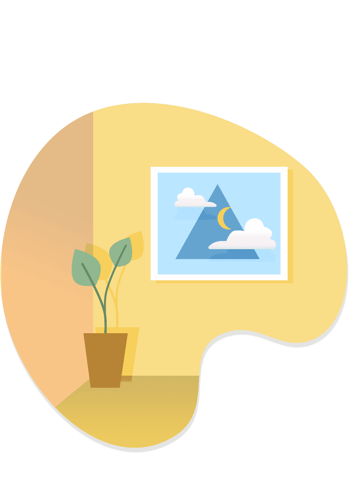
Secondary Illustrations
I discovered that secondary illustrations and icons provide coherency throughout the website. Since my goal was to make the website personable and visually pleasing, I wanted to show a little bit of "Lalaaree" in every corner of the site.
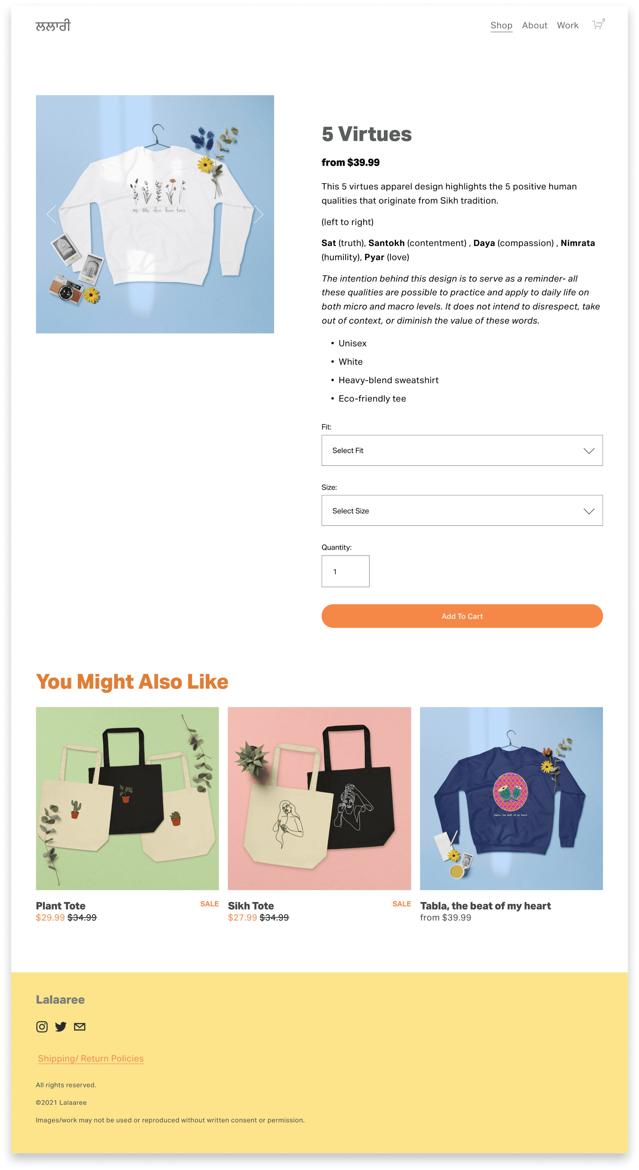
the final design
Once my design was in a place that I was happy with, I brushed up on my marketing skills to pull traffic in to the website.
Over two weeks, I started making promotional posts on Instagram and built hype around the launch of my products.
Thanks to traction from marketing on Instagram, I had 30 sales within the first hour of launching my website. Within a few months, I was able to make over 5k in revenue.
Customers reached out to me to tell me that my website was easy to use, beautiful, and inspirational. It made me happy that I could combine my design and business skills on this project.
Filtering
I want to focus on minimizing lengthy scrolls for products on mobile-maybe this means I add filters within the search bar.
Pinterest for Marketing
Linking my products to Pinterest with custom tags could increase traffic to the website. I’m excited to test this hypothesis.
